RocLab
A student-led branding and social media initiative focused on increasing awareness of RocLab's student-built products and fostering engagement within the University of Rochester community.


Problem
My focus was on addressing low awareness and skepticism around using a student-built tool over the official course scheduler. With limited time and budget, I had to create compelling, trust-building content that clearly communicated Melcourses’ benefits and ease of use, all while connecting people to the Gus the mascot to create a brand people will enjoy to look back at and watch.

Work Process
I focused on clean, eye-catching graphics that mirrored the actual design of the product, so students could instantly understand what they were getting. Throughout the process, I stayed flexible, adjusting content and timing based on what was performing best and what students were saying in real time, adding casual stories to fill in gaps from post to post.
We used:
Notion to keep everything organized, delegating certain tasks to each team member and setting a clear deadline for such events (as shown on the right)
different software to edit videos, such as Adobe, Photoshop, Canva, Procreate and ScreenStudio, as we wanted to create the best campaign/designs for our audience!
Roclab Bee Mascot Drafts
Design Priorities:
Clean and minimal aesthetic, easy to recognize at a glance (think app icon or social post thumbnail).
Strong silhouette, readable even in small sizes or on digital signage
Expressive eyes and simple features to convey emotion and personality without clutter.






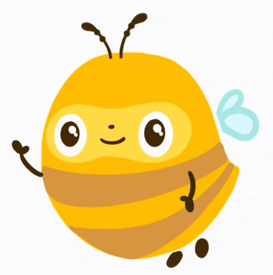
Final Mascot
The selected mascot design for the Roclab Bee, Meet

Goal
We wanted to increase student usage of melcourses by building trust and awareness through student-centered messaging. From a user experience perspective, the aim was to highlight how Melcourses solved real scheduling frustrations and is relatable towards the audience, making silly stories with poll voting. Aesthetically, the marketing needed to feel clean, cute, modern and approachable, matching the product’s simple yet effective design.
Campaign
To start, I considered different strategies to reach students where they were, whether it would be on campus or online. I brainstormed meme style posts, interviews and scheduled posts to events and collaborative reposting from other clubs. I also explored different tones of voice, whether it would be humorous or informative (or both!) to see what would resonate most with our audience.


Results
Within the first few weeks of launching the campaign, Melcourses saw a noticeable spike in traffic and engagement. Social content highlighting key features like course filtering and visual schedules received strong shares and positive feedback, helping validate the messaging strategy.
We were able to serve over 20% of the undergraduate student population and receiving a Net Promoter Score (NPS) of 81.
